Nextdoor & Microsoft Local News Partnership
Project Introduction
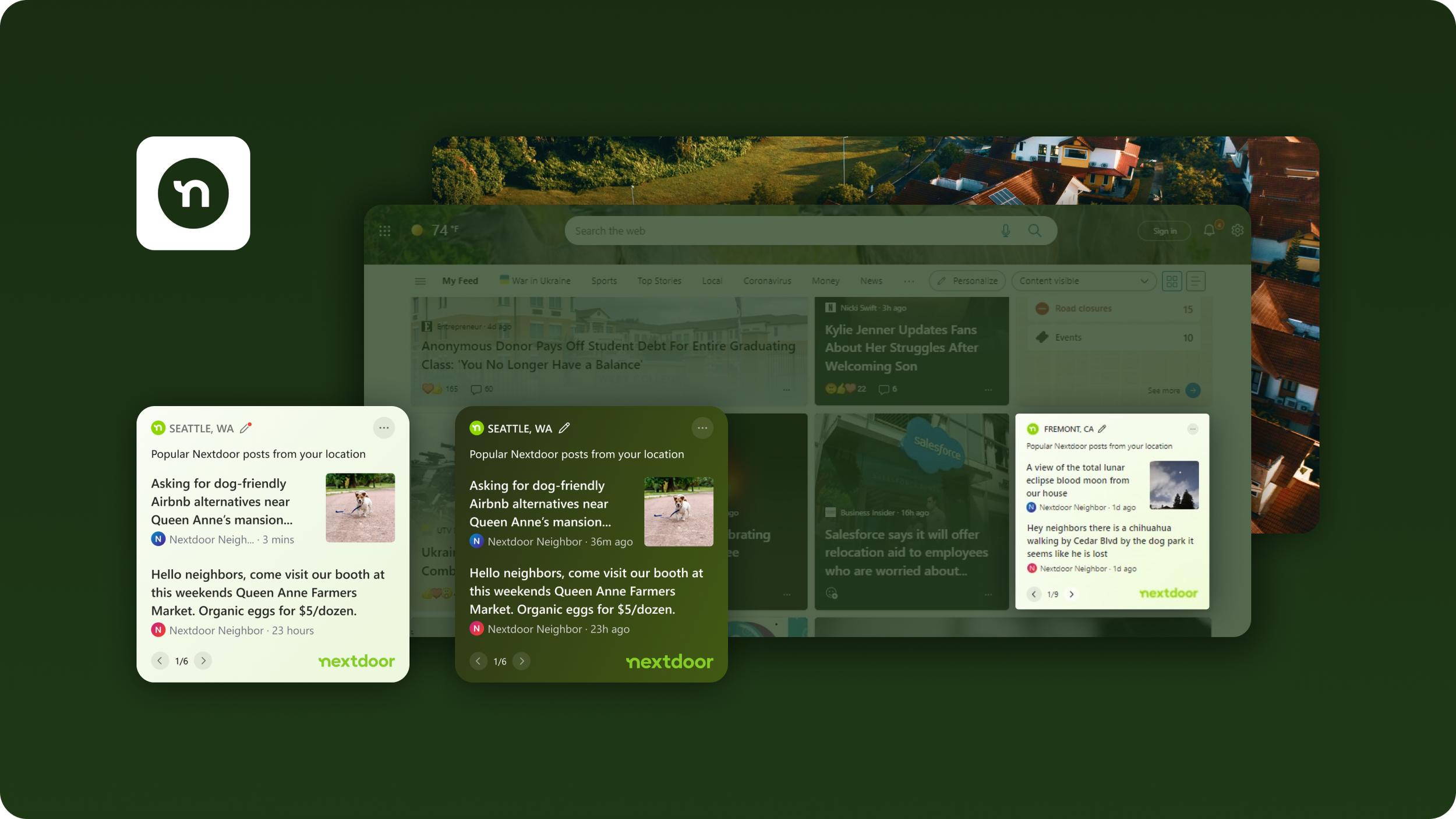
The Microsoft News Feed is a source of personalized news for Microsoft users, with many entry-points across the Windows, Edge, Bing and Microsoft Start mobile app platforms. Nextdoor is a geo-based social media platform where neighbours share news, support local businesses and get updates from public services. Both the Microsoft News Feed & Nextdoor.com see hundreds of millions of visitors per month.
Opportunity Definition
This presented a partnership opportunity to help round out the local news offering on the Microsoft platform, while driving additional traffic to Nextdoor. Existing design proposals were met with some additional requirements and so I was introduced to the project to address those needs. From this point, I led this design initiative in collaboration with my Product Manager and in consultation with my Design Mentor. Here are the principal needs that were put forth as a definition of done:
Revise existing design to better leverage built-in UX patterns native to the Microsoft Start Framework
Improve communication and trust by revising card structure, adding action prompts, descriptive copy and avatar
Address brand-identity concerns from Nextdoor team relating to color usage, logo recognition, UI iconography, etc
Designing the Product Experience
Work began with building wire-frame variations that accounted for the new needs of the stakeholders. Following this phase, I met with the Design System team to propose the wired concepts and help gather feedback on how to best leverage the current framework given the challenges posed. This step proved resourceful, with the Systems team pointing me to several UX pattern references across the platform. I was able to leverage patterns from the Sports, TakeLessons, LinkedIn and Weather cards to accommodate the stakeholder needs. The benefits those resources provided:
Sports card affords for a brand icon in the top-left corner, which reinforces brand presence and identity
TakeLessons card includes a descriptive string below the title to communicate the value of the card to the user
LinkedIn card stories include the avatar of the story creator, which adds credibility and visual interest
Weather card communicates the users location, affords an edit control in-line and offers a tool-tip on hover
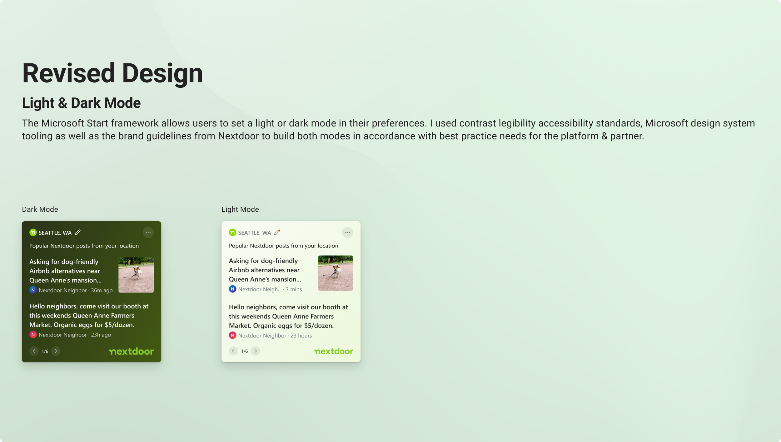
With a full toolkit, I was equipped to build many variations that aligned closely with the requirements until I reached a confident proposal. I mapped out the user flow to consider all user actions as well as light/dark mode preferences. I also had to be mindful of edge-case scenarios relating to user-inputs and long location names.
Lastly, I worked alongside the development team to make sure we were clear on all the changes to ensure a smooth hand-off. I facilitated the bug-bashing process with follow-ups at the testing phase, up until the product was shipped.
Project Results
Reception has been very positive since launch and the product continues to be a highlight of the Local News vertical for millions of Microsoft & Nextdoor customers worldwide.
Project Members
Product Designer: Paul Methot
Design Supervisor: Cole Menard
Product Manager: Tadd Murphy


