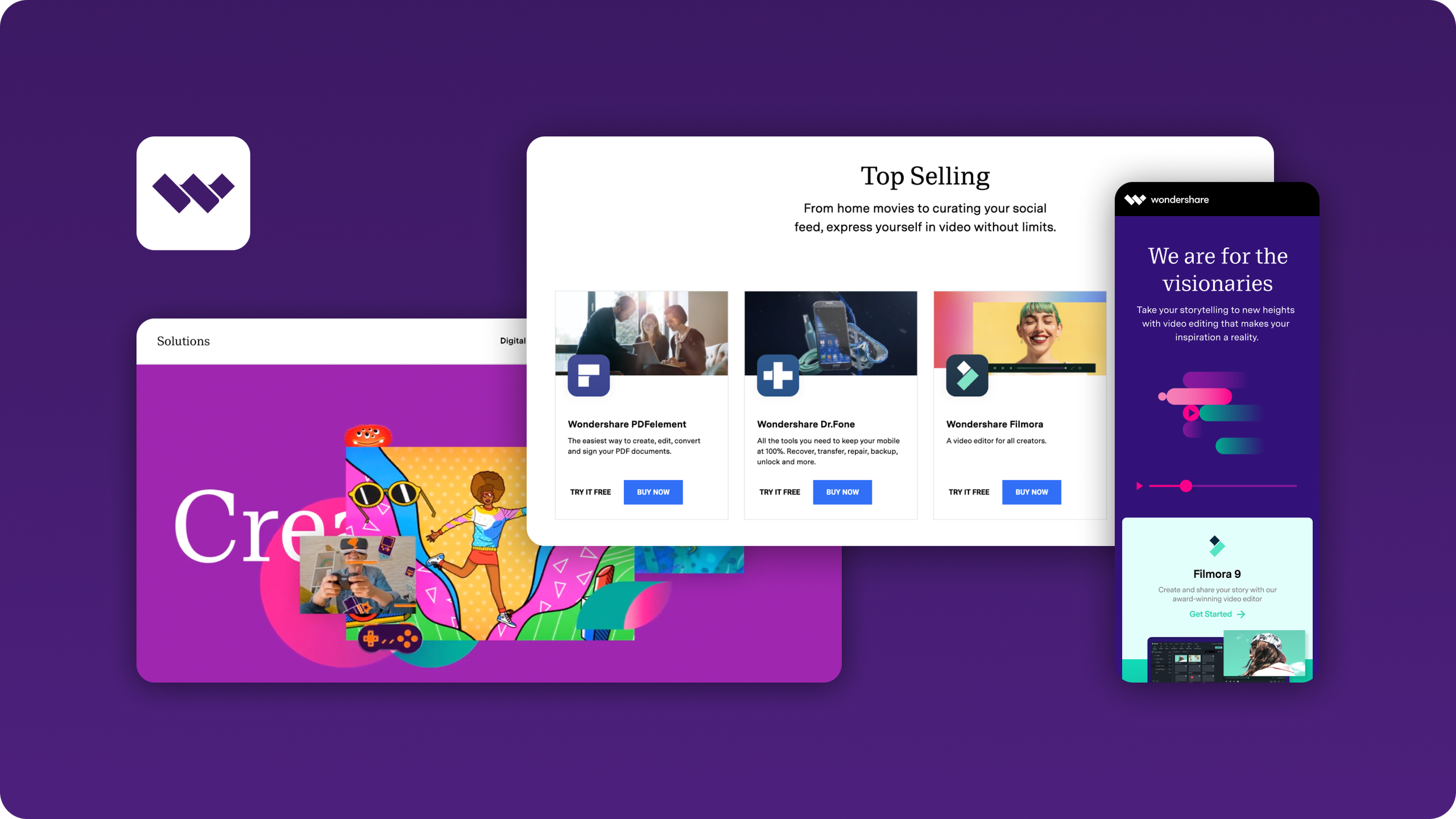
Wondershare.com
Project Introduction
Wondershare Technology Inc is a leading software development and publishing company, with more than 30 million active users per year. Headquartered in Shenzhen, China, they have a portfolio of 65 products available in 10+ languages. After having gone public on Shenzhen Stock Exchange, Wondershare had begun to grow at a rapid rate and the brand needed a proper platform from which to express and realize that growth.
Opportunity Definition
When this project began in 2019, wondershare.com had not been updated since 2016 and needed a new strategy and framework. The new site would need to establish Wondershare on a higher plateau, positioning itself to compete with the likes of Adobe and Black Magic. The main focus of the strategy would require Wondershare’s internal-facing, investor-facing and customer-facing branding to align going forward. This meant that products and services which had been building a reputation and community for themselves, would all need to come under the Wondershare umbrella. Such a drastic restructure would put a greater emphasis on the Wondershare brand, meaning clear brand communications at every touchpoint throughout the company would become more pressing (customer service, employer branding, etc). The starting point for such a change would be the website experience.
Designing the User Experience
I was involved in the re-design from the project inception, which gave me a unique involvement in each step of the site development. This began with strategy development, user-studies, sitemap architecture, wireframes/prototypes. In this early stage, Marketing, Product, PR and Business Development/Sales teams were included in order to best understand the issues of the previous site and hear out ideas for the new site. One unique addition to the team was a creative copywriter, with whom I collaborated daily to ensure strategy, visuals and overall experience were in sync. Each of the project stakeholders were retained throughout this process for testing of prototypes, as well as to provide valuable insights into target market research, etc. For example, we learned through Google Analytics data that a large number of wondershare.com visitors are on mobile devices, which emphasized a need towards responsive components and layouts.
Designing the User Interface
A modular grid was implemented, as was a library of components that I helped create for use in different contexts. Colour, photography, iconography, typography and font-style usage guidelines were established at this stage. This was a great opportunity to work with the Art Directors to establish a new identity for Wondershare. We actively worked to keep components to a minimum in order to keep interactions clear and simple. Wondershare’s slogan at the time was ‘Technology Simplified’ and we needed to stay true to that.
Project Results
Metrics have shown improvements in the site’s overall performance. I was also involved in the design of the 2021 website updates as the company strategy had continued to evolve beyond the initial structural update of 2019.
+15% increase in total page views
+15% increase unique page views
+13% increase in average time on page
Project Members
UX Design Leads: Paul Methot, Mariam Khan
Art Direction & Motion Graphics: Stephanie Joo, Guilherme Veloso
Design Supervisor: Shatanu Jahagirdar
Software Used
Figma, Sketch, Invision, Adobe Photoshop, Adobe Illustrator


